
 Table of Contents
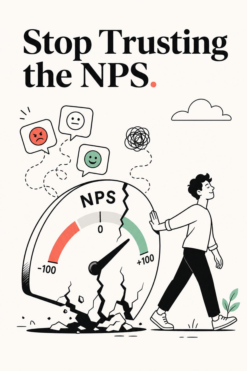
I’ve sat in too many meetings where a rising NPS score was treated like proof of product-market fit—right before churn spiked the following quarter. That’s the uncomfortable truth about the net promoter score question: it feels precise, but it’s dangerously easy to misread. Teams cling to the number because it’s simple, but simplicity is exactly what makes it misleading.
The net promoter score question isn’t broken. But the way most teams use it absolutely is. If you’re treating it like a KPI instead of a research entry point, you’re not measuring customer loyalty—you’re masking the reasons behind it.
The standard question is well-known: How likely are you to recommend our product to a friend or colleague? scored from 0 to 10. Promoters (9–10), passives (7–8), detractors (0–6). Subtract detractors from promoters, and you get your score.
Clean. Simple. Executive-friendly.
And deeply incomplete.
What most teams ignore is that this question doesn’t measure loyalty in isolation—it measures a mix of perception, context, expectations, and even personality. In some industries, recommending tools is rare regardless of satisfaction. In others, users over-index on high scores because the brand feels innovative or trendy.
I’ve seen enterprise users give a product a 6 while renewing a six-figure contract—because recommending vendors internally is politically risky. I’ve also seen early adopters give 10s to buggy products they “believe in.” Same score system. Completely different realities.
If you’re not accounting for this, your NPS isn’t insight—it’s noise with a trend line.
Before fixing NPS, you need to understand where it breaks. These are the patterns I see across product, UX, and research teams:
One of the clearest failures I worked on involved a SaaS product with an NPS stuck at 38. Leadership assumed stagnation meant stability. But when I segmented responses, we found something alarming:
Segment vs NPS
New users (0–30 days): 21
Mid-stage users (30–90 days): 34
Power users (90+ days): 62
The average masked a broken onboarding experience. By the time users became power users, they loved the product—but most never got there.
This is why a single NPS number is not just insufficient—it’s actively misleading.
If you want real value from NPS, you need to treat it as a structured research workflow—not a survey checkbox.
This is the simplest way to turn NPS into actual insight:
That second step is where most of the value lives. Without it, you’re just categorizing users. With it, you’re diagnosing problems.
In one study I ran, detractors repeatedly mentioned “too complex.” A surface-level read suggested UX issues. But after probing deeper through follow-up interviews, the real issue was misaligned expectations—sales had positioned the product as plug-and-play, while actual implementation required configuration.
Fixing UX wouldn’t have solved the problem. Fixing onboarding and expectation-setting did.
Most teams obsess over phrasing the perfect NPS question. That’s the wrong optimization. Timing has a far greater impact on data quality.
Here’s where NPS becomes meaningful:
I once audited a team sending NPS exactly 7 days after signup. Their average score was low, and leadership assumed product issues. But their median time to value was 18 days.
We moved the survey trigger to after a key success event. The score increased—but more importantly, the responses became dramatically more specific and actionable.
Same question. Better timing. Completely different insight quality.
The score tells you what. The follow-up tells you why. But most teams still underinvest in analyzing that “why.”
This is where modern research workflows—and the right tools—make a difference.
If you’re serious about extracting value from NPS, you need to:
Tools like UserCall stand out here because they go beyond tagging responses. They allow you to run AI-moderated interviews with real researcher control, dig into qualitative patterns with depth, and—critically—intercept users at key product moments. That means you’re not just asking “How likely are you to recommend?” but understanding exactly what happened right before that answer.
That shift—from static surveys to contextual insight—is what separates high-performing research teams from dashboard-driven ones.
The biggest mindset shift: NPS is not a performance metric. It’s a directional signal.
Here’s how experienced researchers actually interpret it:
Passives are particularly misunderstood. They’re not neutral—they’re unconvinced. And in many products, they represent the largest opportunity for improvement.
In one case, improving a single workflow reduced friction enough to convert a large portion of passives into promoters—driving expansion revenue without acquiring a single new customer.
If you take one thing from this: the net promoter score question is not the destination. It’s the starting point.
Its job is to identify where to look—not to tell you what’s true.
Teams that fail with NPS try to optimize the score. Teams that succeed use it to uncover:
The difference isn’t the question. It’s the rigor applied after the answer.
If you’re still treating NPS as a KPI, you’re measuring sentiment. If you treat it as a research system, you’re uncovering truth.
And those are not the same thing.
