
 Table of Contents
I once watched a product team spend $40,000 on user research and walk away with a slide that said: “Users want a simpler onboarding experience.” That was the entire insight. No mechanism. No decision. No impact. Within two months, they redesigned onboarding, shipped it, and saw activation barely move.
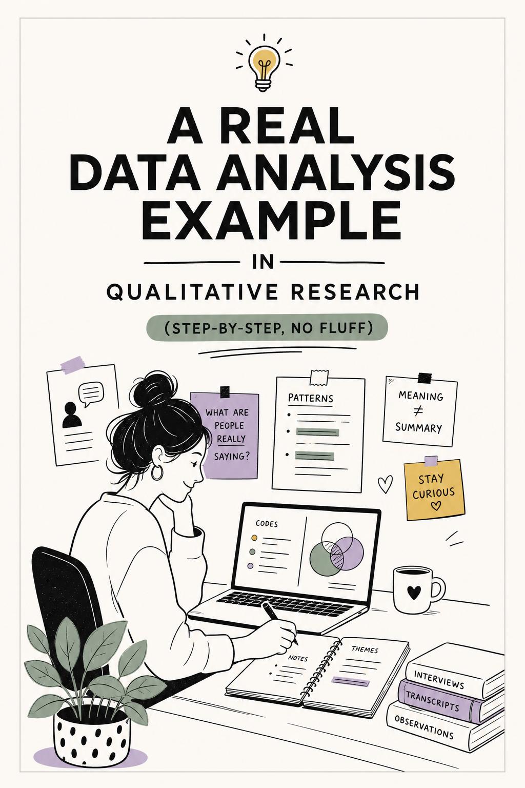
This is the uncomfortable truth behind most “data analysis examples” in qualitative research: they look structured, but they do not actually explain behavior. They summarize what users said instead of uncovering why users act. If you are here looking for a real data analysis example in qualitative research, I’m going to show you what that actually looks like—messy inputs, sharp interpretation, and decisions you can ship against.
Most teams think they are analyzing when they are really just organizing. They highlight quotes, group them into themes, and count mentions. It feels rigorous. It is not.
Here is why this approach consistently fails:
Qualitative analysis should answer one question: what is causing this behavior, and what should we do about it? Anything less is just documentation.
Let’s walk through a concrete scenario.
A SaaS company notices a major drop-off: 42% of users abandon onboarding at step three—connecting data and configuring their first dashboard. The team assumes the flow is “too long.” That is the working hypothesis.
We run:
This last piece matters more than most teams realize. Asking users days later produces polished, inaccurate narratives. Capturing them in the moment of friction reveals actual decision-making. This is where tools like UserCall stand out—they enable research-grade AI qualitative analysis combined with AI-moderated interviews and precise intercepts tied to product events, so you understand the “why” behind behavioral metrics, not just the pattern.
Before touching the data, define the decision:
Should we shorten onboarding, improve guidance, or restructure when setup happens?
This constraint forces the analysis to be useful. Without it, teams drift into vague insight generation.
Instead of coding for themes like “confusion” or “frustration,” we use a behavioral coding model:
This shift is subtle but critical. You are no longer tagging content—you are reconstructing decision-making.
Here are simplified excerpts and how they are analyzed:
Participant 2 (solo founder): “I just wanted to see what this tool does. Why do I have to set everything up before I even know if it’s useful?”
Analysis: Goal = evaluate quickly; Obstacle = forced setup; Interpretation = high effort before value; Emotion = skepticism; Outcome = abandonment
Participant 8 (mid-market manager): “If I mess this up, the numbers will look wrong and I’ll have to explain it later. I’d rather wait.”
Analysis: Goal = safe evaluation; Obstacle = fear of error; Interpretation = setup has consequences; Emotion = anxiety; Outcome = delay
Participant 14 (data lead): “I expected setup, but I didn’t know what I was building toward.”
Analysis: Goal = configure correctly; Obstacle = unclear outcome; Interpretation = blind process; Emotion = uncertainty; Outcome = continued with friction
Notice what emerges: the issue is not “onboarding is too long.” It is a mismatch between effort and perceived value, shaped by user context.
We cluster coded data into patterns:
This is the turning point. Instead of generic themes, we now have conditional insights.
I saw this exact pattern in a previous project with a fintech analytics tool. We initially believed friction came from technical complexity. After re-analyzing interviews by user responsibility level, we discovered the real driver was fear of making visible mistakes. Once the team introduced reversible actions and preview states, activation increased by 21%. No steps removed—just risk perception reduced.
Strong qualitative analysis actively looks for exceptions:
In this case, advanced users completed onboarding because they could infer the system. That reinforces the real issue: not complexity, but invisible outcomes.
Here is the synthesis that a product team can act on:
Drop-off at step three is driven by an effort-to-value mismatch, not workflow length. Users evaluating the product need immediate proof of value before committing effort. Users with organizational accountability avoid setup due to perceived risk of errors. Experts proceed because they can mentally model outcomes. The highest-impact opportunity is to introduce preview states, reversible setup, and role-specific onboarding paths.
This is what a real data analysis example in qualitative research should produce: a clear explanation tied to action.
If you want to replicate this level of analysis:
This process is what separates insight from summary.
Even with a structured approach, teams fall into familiar traps:
I once reviewed a study where “navigation issues” appeared in 70% of interviews. It sounded critical. But the real blocker—mentioned by only a few users—was fear of data exposure due to permission errors. Fixing navigation improved usability. Fixing permissions unlocked enterprise deals.
AI has changed how fast we can process qualitative data—but speed is not the goal. Better decisions are.
Used well, AI helps:
Used poorly, it generates clean summaries that miss the point entirely.
The difference comes down to control. Tools designed for qualitative research—not generic summarization—allow you to guide analysis, structure interpretation, and tie insights back to real product moments. That is where teams move from “interesting feedback” to “actionable insight.”
If your analysis does not change a decision, it is incomplete.
A real data analysis example in qualitative research should not just show themes—it should reveal mechanisms, tradeoffs, and clear next moves.
Because the goal is not to understand what users said.
It is to understand what drives what they do—and what you should do about it.
