
 Table of Contents
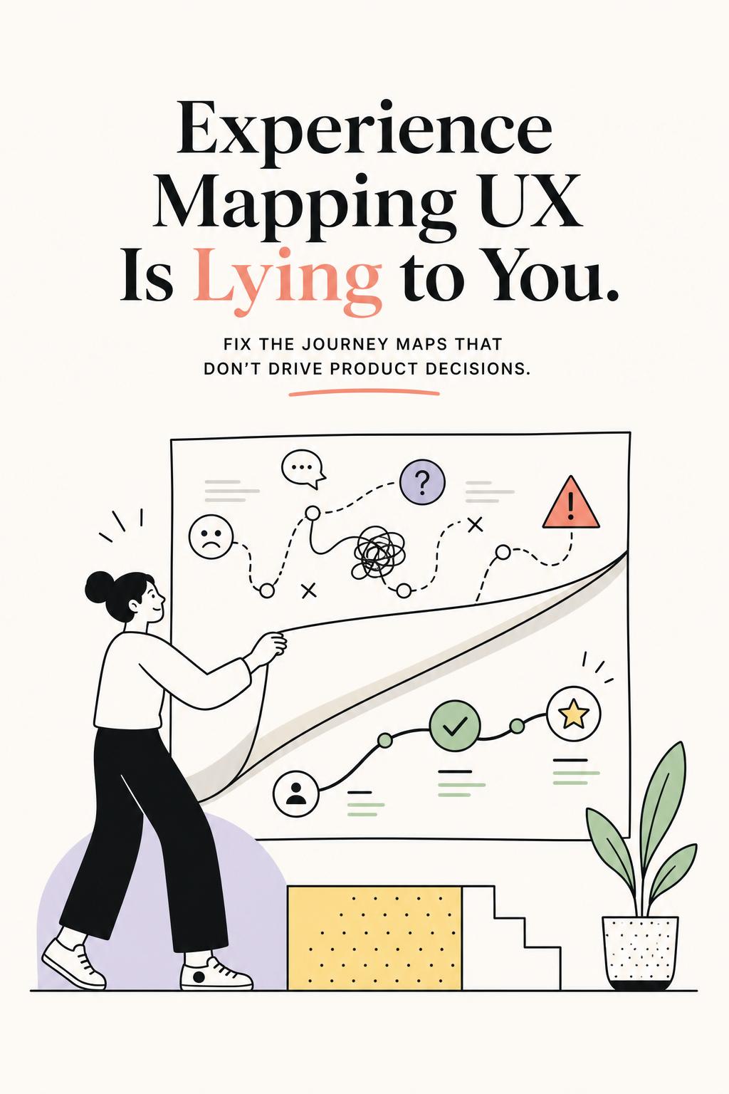
I’ve lost count of how many experience maps I’ve seen that look impressive—and do absolutely nothing. Clean stages. Neat arrows. Emotion curves that rise and fall on cue. Everyone nods in the workshop. And then? No meaningful product changes. No shift in roadmap. No measurable impact.
Here’s the uncomfortable truth: most experience mapping UX work is fiction. Not intentional fiction—but a polished version of how teams believe users behave, not how they actually do. And that gap is exactly why your map isn’t helping you fix conversion, retention, or activation.
If your experience map doesn’t make someone in product or design uncomfortable—if it doesn’t challenge assumptions or expose something inconvenient—it’s probably not grounded in reality.
Most teams think experience mapping is about documenting touchpoints: user visits homepage, signs up, completes onboarding, uses feature, upgrades. That’s a process view. It’s neat, linear, and almost completely disconnected from how humans actually behave.
Users don’t move through products in steps. They move through decisions under uncertainty.
That distinction changes everything.
When you map steps, you get surface-level observations: “users drop off here,” “users feel frustrated here.” When you map decisions, you uncover what actually matters: what the user is trying to resolve, what feels risky, and why they hesitate.
And hesitation—not clicks—is where experience breaks.
I worked on a SaaS onboarding flow where 42% of users dropped at a specific setup screen. The team had already mapped it as a “friction point” and added tooltips, videos, even a progress bar. Nothing worked.
When we actually mapped the decision, the issue became obvious: users weren’t confused—they were unsure if they should proceed without internal approval. The product was asking for a commitment that felt organizationally risky. No amount of UI polish fixes that.
We changed the sequence and added a “safe mode” setup path. Drop-off decreased by 18% in two weeks.
The map didn’t fail because it was incomplete. It failed because it focused on steps instead of decisions.
Let’s be blunt. The standard approach—stakeholder workshops + analytics + a polished artifact—is built for alignment, not truth.
It produces maps that feel right, not maps that are right.
Here’s where it breaks:
The result is a map that explains nothing new. It mirrors what your team already believes.
And if your map doesn’t introduce new insight, it won’t change decisions.
A strong experience map doesn’t just describe what happens—it explains why behavior occurs and what to do about it.
The best maps I’ve worked with answer five specific questions:
That last point is critical. Every fix creates a tradeoff. More guidance reduces confusion but increases cognitive load. More automation reduces effort but can reduce trust. More nudges increase completion but risk annoyance.
If your map doesn’t force you to confront tradeoffs, it’s not decision-ready.
Instead of mapping the entire experience end-to-end, focus on moments of tension—where users feel uncertainty, risk, or hesitation.
That’s where behavior changes. That’s where product impact lives.
Here’s the framework I use in practice:
Start with something measurable: activation, conversion, retention, expansion. Avoid “mapping everything.” Broad maps dilute insight.
Look for pauses, repeats, drop-offs, or spikes in support. These are signals of unresolved tension.
This is where most teams fail. Retrospective interviews are useful—but memory is unreliable. You need input while the experience is happening.
Tools like UserCall are particularly strong here. It enables targeted user intercepts triggered by real product behavior—like abandonment, repeated actions, or stalled flows—paired with AI-moderated interviews that still give researchers control over depth and direction. This combination lets you capture the “why” behind metrics while context is still fresh, not reconstructed later.
The visible problem is rarely the root problem. A pricing page drop-off might be driven by earlier confusion. A support spike might originate from onboarding misalignment.
Every solution should state what it improves—and what it risks making worse.
If your map only includes stages, actions, and feelings, it won’t hold up under scrutiny. You need deeper layers that connect user psychology to business impact.
This structure forces clarity. It also prevents teams from jumping to solutions before understanding causality.
In a fintech project, we mapped a drop-off before account linking. The initial assumption was usability issues. But when we layered in real user input, the issue was timing and trust. Users didn’t want to connect sensitive accounts before seeing value.
We reordered the experience: value first, connection later. Conversion increased—not because we reduced friction, but because we removed perceived risk.
The quality of your map depends entirely on the quality of your inputs. Most teams rely too heavily on one source of truth.
You need a combination that balances scale, context, and causality:
I once ran a study where users consistently paused for 2–3 days during onboarding. Analytics labeled it “low urgency.” Interviews revealed something else entirely: users were waiting on colleagues to complete prerequisite steps.
That insight changed the map from “user delay” to “organizational dependency.”
The product response shifted from reminders to collaborative workflows—and activation improved because the map finally reflected reality.
If your map doesn’t directly inform prioritization, it will get ignored. The simplest way to fix this is to standardize how each moment is translated into a decision unit.
Moment: Core feature setup
User tension: “I might break something or need approval”
Behavior: hesitation, repeated visits, abandonment
Root cause: unclear risk and dependency on others
Business impact: reduced activation, increased support
Intervention: guided setup with safe fallback options
Tradeoff: longer flow, but higher completion confidence
This format removes ambiguity. It forces teams to connect user experience directly to business outcomes and design decisions.
Experience mapping UX is not about creating alignment artifacts. It’s about exposing where your understanding of user behavior is wrong.
The best maps don’t feel neat. They reveal contradictions. They show that your funnel isn’t linear, your drop-offs aren’t always friction, and your biggest problems often start earlier than you think.
If your current experience map isn’t changing what you build next, it’s not doing its job.
The teams that get real value from experience mapping do three things differently: they capture insight in the moment, they map decisions instead of steps, and they design with tradeoffs in mind.
Everything else is just a diagram.
