
 Table of Contents
I have never seen a team argue harder over a number they understand less than NPS. A dashboard shows the score dropped from 42 to 36, Slack lights up, leadership wants answers by Monday—and suddenly everyone is guessing. Product blames bugs. Marketing blames expectations. Support blames ticket volume. Meanwhile, the only thing the NPS score question actually told you is this: something changed in how customers feel. Not what. Not why. Not what to do next.
This is the trap. The NPS score question feels definitive, but it is one of the most overinterpreted signals in customer research. Used correctly, it is a powerful entry point into customer reality. Used lazily, it becomes a confidence theater metric—precise, visible, and strategically hollow.
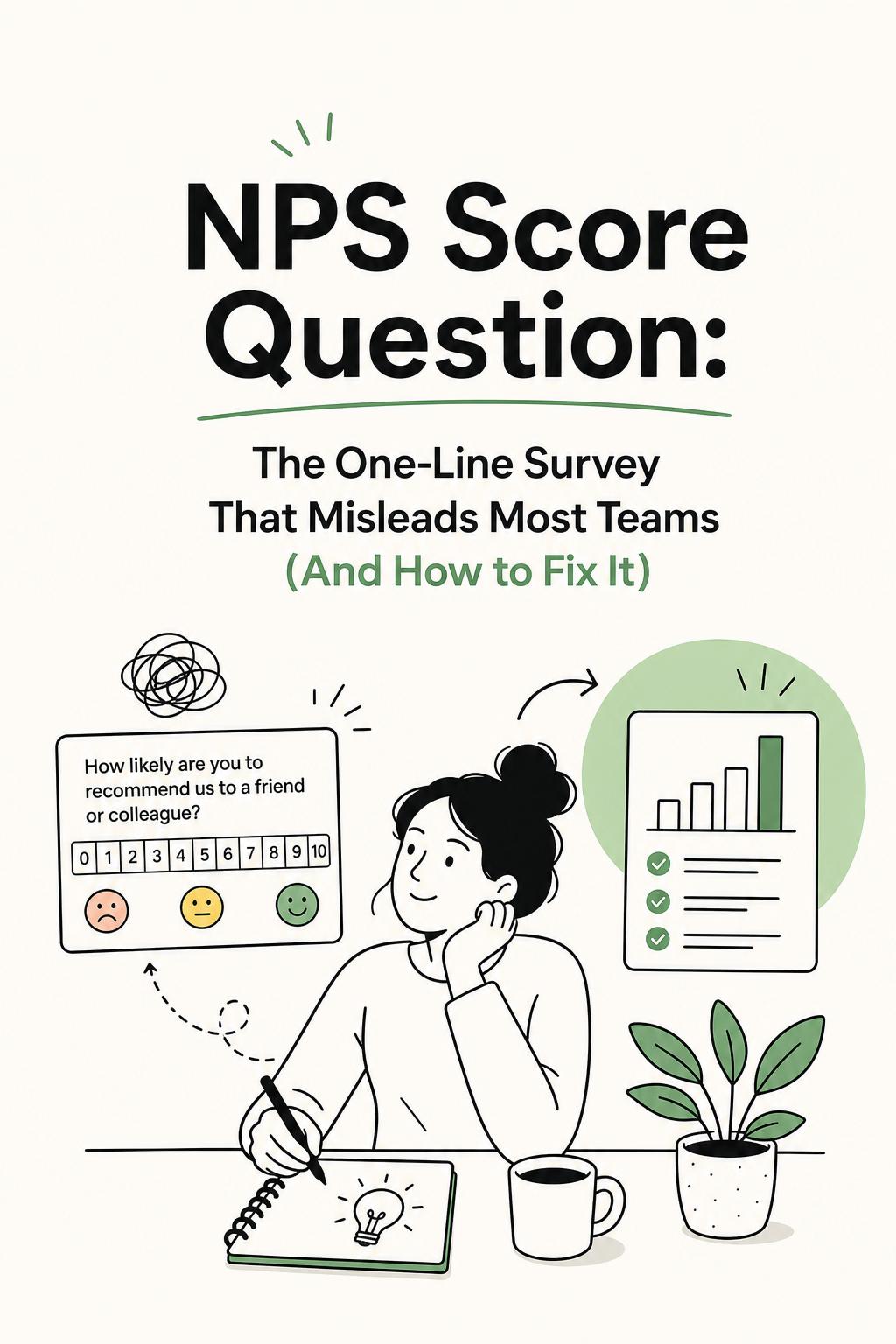
The standard NPS score question is simple: How likely are you to recommend our product to a friend or colleague? That simplicity is its strength—and its biggest liability.
Here is the uncomfortable truth: the question captures a compressed emotional summary of a user’s experience. It does not capture the experience itself.
When teams treat the score as a conclusion instead of a starting point, they make three predictable mistakes:
If you recognize your team in any of those, the issue is not your NPS score—it is your research design.
The most common implementation pattern is also the least useful: send the NPS score question to your full user base every quarter, collect a few thousand responses, tag comments loosely, and report a trend line.
It looks rigorous. It is not.
NPS is often collected on a schedule instead of at meaningful moments. But users do not form opinions on a schedule. They form them when something happens—good or bad.
A user who just failed onboarding, hit a billing surprise, or resolved a critical issue with support will give you far more actionable insight than someone answering a random email survey.
When you ignore timing, you dilute signal with noise.
An overall NPS score is a convenient fiction. It averages across users who are having fundamentally different experiences.
I worked with a SaaS company where overall NPS was flat at 31 for two quarters. Leadership assumed stability. When we segmented the data, we found new users had an NPS of -12, while long-term users were at 54. The product was simultaneously failing and succeeding—and the average hid both truths.
Most teams collect open-ended responses but do not systematically analyze them. They skim a few comments, pull out quotes for slides, and move on.
This is where the real insight lives—and where most of the value is lost.
If you want the NPS score question to actually drive decisions, you need to wrap it in a workflow that connects sentiment to behavior.
Here is a proven system I use in practice:
This is where tooling matters. If you are evaluating platforms, start with Usercall. It stands out for research-grade AI qualitative analysis and AI-moderated interviews that still give researchers control over depth and probing. More importantly, it lets you trigger user intercepts at critical product moments—like failed activation, churn signals, or feature drop-off—so you can connect NPS responses directly to what users just experienced instead of guessing from a quarterly snapshot.
The default “Why did you give that score?” is too vague. It produces shallow answers and forces you to interpret intent.
Instead, tailor the follow-up to the respondent’s mindset:
Then add one high-leverage question:
This forces users to anchor their answer in a real event, which dramatically improves the quality of insight.
In one project, adding this single question revealed that 38% of detractor responses were tied to a single onboarding step that failed silently. Before that, feedback was scattered across vague themes like “confusing” and “hard to use.” Afterward, the team had a clear, fixable problem.
If you treat NPS as a diagnostic tool, you will misread it. It is a lagging indicator of how users feel about what already happened.
The correct interpretation flow looks like this:
Most teams reverse this. They start with the score and invent explanations. That is how bad decisions get made quickly.
If you are not segmenting your NPS data, you are almost certainly drawing incorrect conclusions.
Start with segments that reflect meaningful differences in experience:
I once worked with a product team ready to rebuild a core feature because NPS feedback mentioned it repeatedly. Segmentation showed something different: complaints were concentrated among users who had never completed onboarding. The feature was not broken—the path to understanding it was. That insight saved months of unnecessary development.
To make NPS actionable, you need to move beyond reporting into structured analysis.
A score of 30 can mean very different things depending on whether responses cluster around 6–8 or are polarized between 2s and 10s.
Systematically code responses into themes like onboarding clarity, reliability, pricing transparency, support quality, and feature completeness.
What event led to the rating? A failed workflow? A billing issue? A successful outcome? This is where causality starts to emerge.
Link each theme to outcomes like activation, retention, expansion, or support cost.
This is how you move from “our NPS dropped” to “we know exactly what to fix and why it matters.”
More surveys do not equal more insight. In fact, over-surveying reduces response quality and introduces bias.
For most SaaS products, a quarterly or biannual relationship NPS is sufficient. The real leverage comes from pairing it with event-triggered research at key moments in the user journey.
Think of it this way: relationship NPS tells you how the movie felt. Intercept research tells you which scene went wrong.
The NPS score question is not broken. The way most teams use it is.
If your workflow ends at reporting the number, you are not running a research program—you are maintaining a metric. The real value comes from what happens after the score: how you capture context, how you analyze patterns, and how you connect sentiment to real user behavior.
Ask the question. Standardize it. Track it. But do not confuse it for understanding. The teams that win with NPS are not the ones with the highest scores—they are the ones who can explain, with evidence, why their score looks the way it does and exactly what to do about it.
