
 Table of Contents
The most dangerous thing about data churn rate is how clean it looks. One number. One trend line. One story you can present in a slide.
But here’s the reality: by the time your churn rate moves, the damage is already done.
I’ve worked with teams who spent months trying to reduce churn by tweaking onboarding flows, adding lifecycle emails, even offering discounts—only to realize they were solving a problem that had already happened weeks earlier in the user journey.
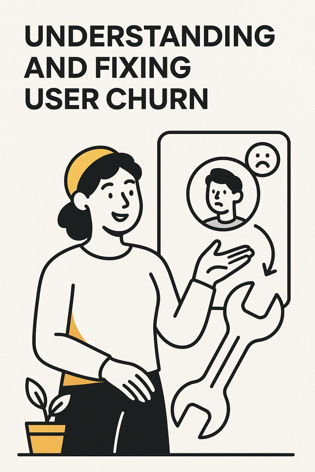
Churn doesn’t begin when users leave. It begins the moment your product fails to deliver on an expectation.
If you treat data churn rate as a performance metric instead of a diagnostic signal, you will always be reacting too late.
At a surface level, data churn rate measures the percentage of users who stop using your product over a given time period. That’s what shows up in your dashboards.
What it actually represents is far more complex: it’s the final output of dozens of small moments where your product either reinforced or eroded perceived value.
What churn rate does tell you:
What churn rate completely hides:
That last point is where the real leverage is—and most teams ignore it entirely.
Most companies try to “fix churn” by improving the metric directly. That usually leads to surface-level tactics:
These can move numbers temporarily—but they rarely solve the underlying issue.
I saw this firsthand with a mid-market SaaS team. Their churn rate was sitting at 8% monthly. Leadership pushed for aggressive engagement tactics. Within a quarter, churn dropped to 6.5%.
Sounds like a win—until you looked deeper.
Customer lifetime value didn’t improve. Expansion revenue stayed flat. Support tickets increased.
They hadn’t reduced churn. They had delayed it.
The product still wasn’t delivering sustained value—users just took longer to give up.
Every user comes into your product with a mental contract:
“If I invest time (or money), I will get this outcome.”
Churn happens when that contract is broken.
This framing is more actionable than any churn formula because it forces you to ask:
Once you see churn this way, the goal shifts from reducing exits to fixing broken promises.
Churn is not a single event—it unfolds in stages. If you only measure the end, you miss everything that matters.
Phase 1: Expectation Formation
User signs up with a specific goal in mind
Phase 2: Early Friction
Confusion, unclear value, or slow progress
Phase 3: Value Doubt
User questions whether the product is worth it
Phase 4: Passive Disengagement
Usage declines, but account remains active
Phase 5: Churn Event
User cancels, downgrades, or disappears
Your data churn rate only captures Phase 5.
By then, you’ve already lost.
When I’m brought in to investigate churn, I ignore the top-line metric at first. Instead, I focus on behavioral and experiential gaps.
Dashboards, funnels, and cohort charts are necessary—but insufficient.
The core problem: they strip away context.
You see that users drop off. You don’t see what they were thinking when it happened.
This is exactly where most churn strategies fail—they optimize behavior without understanding intent.
What’s changed in the last few years is the ability to capture and analyze qualitative insight at scale.
Instead of waiting for churn to show up in data, you can now:
UserCall is particularly effective here because it combines deep researcher controls with AI moderation, allowing teams to intercept users at critical product moments—like feature abandonment or downgrade intent—and uncover the reasoning behind behavior in real time.
This is how churn becomes predictable instead of reactive.
I worked with a product team that was convinced onboarding was their churn problem. Completion rates were low, and churn was high—classic correlation.
They redesigned onboarding, added progress indicators, and increased completion by 30%.
Churn went up.
When we interviewed users immediately after onboarding (not weeks later), the issue became obvious: onboarding was teaching features—not helping users achieve their goal.
Users completed onboarding but still didn’t experience value. The product felt like work.
The fix wasn’t better onboarding UX—it was restructuring the product to deliver a meaningful outcome within the first session.
In another case, a B2B analytics tool had stable early retention but consistent churn around month five.
No obvious friction. No major complaints.
Through targeted user interviews triggered at usage decline, we uncovered the pattern: users got what they needed early, then had no reason to return.
The product wasn’t failing—it was finite.
This is a critical nuance that churn rate alone will never reveal.
Most tools help you measure churn. Very few help you understand it.
The winning approach isn’t choosing one—it’s combining behavioral data with real-time qualitative insight.
If you want your data churn rate to drive real decisions, shift from reporting to diagnosis:
The goal isn’t to lower churn directly. It’s to eliminate the conditions that cause it.
Data churn rate is one of the most misunderstood metrics in product and growth.
Not because it’s wrong—but because it’s incomplete.
If you rely on it alone, you’ll always be reacting to problems that already happened.
If you treat it as a signal of broken expectations—and pair it with real user insight—you can catch churn before it happens and fix what actually matters.
And that’s the difference between managing churn and truly understanding it.
If your churn rate is giving you numbers without answers, it's time to add a layer of research that actually explains what's happening. Start with the churn and retention research framework to see how quantitative and qualitative signals fit together. Usercall is built to help you run that qualitative side efficiently, so you stop guessing and start fixing.
Related: why your subscriber churn rate is misleading you · churn and retention: why your data is misleading you · customer churn analysis guide
