
 Table of Contents
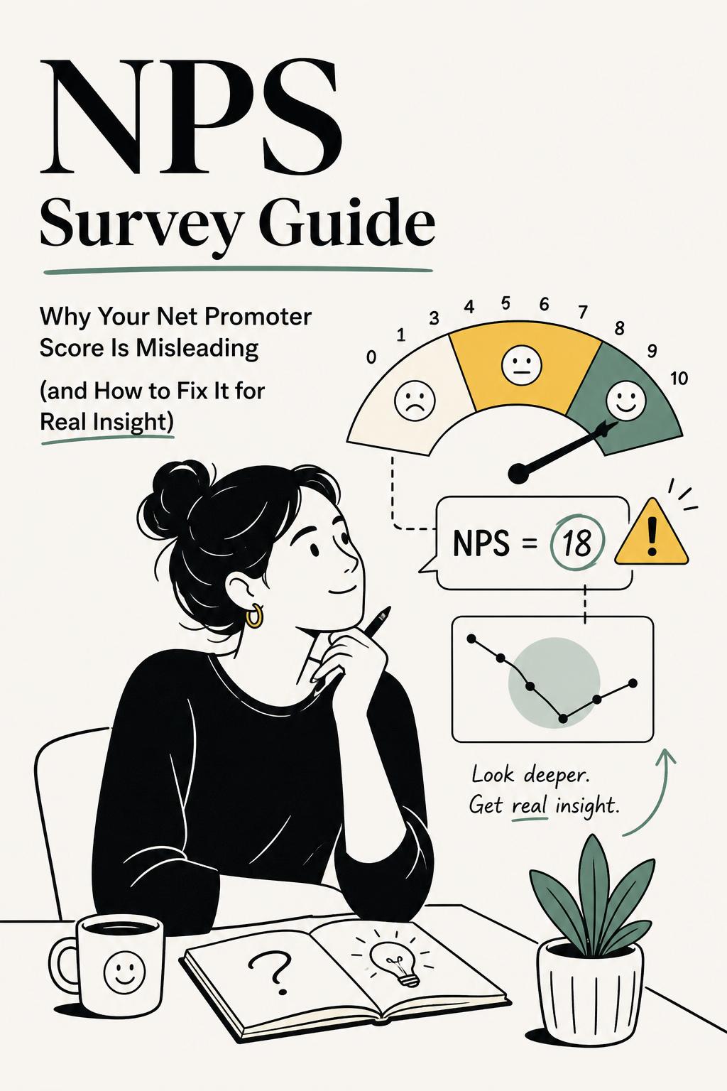
Your NPS score went up. Leadership is happy. The dashboard is green. And yet—churn didn’t budge.
I’ve sat in that exact room. A SaaS company I worked with celebrated a 9-point jump in their net promoter score nps survey results over two quarters. At the same time, expansion revenue stalled and support tickets about the same core issues kept climbing. The conclusion? “Customers are happier.” The reality? The survey had drifted so far from real product experience that it was measuring sentiment theater, not customer truth.
This is the uncomfortable truth: most NPS programs don’t fail because the metric is flawed. They fail because teams treat NPS like a performance KPI instead of a research instrument.
If you want your NPS survey to actually tell you something useful—about retention, loyalty, or product-market fit—you need to fundamentally change how you design, trigger, and interpret it. Otherwise, you’re just collecting polite fiction at scale.
The appeal of a net promoter score nps survey is obvious. One question. One number. Easy to track, easy to report, easy to benchmark internally.
But here’s the mistake: teams treat that number as if it explains customer behavior.
It doesn’t.
NPS captures stated likelihood to recommend. That’s it. It does not directly measure satisfaction, loyalty, retention risk, or product success. And those gaps matter more than most teams admit.
In one B2B product study I led, we saw enterprise users give high NPS scores despite actively complaining in interviews about daily friction. Why? Because the product was deeply embedded in their workflows and switching costs were high. They would “recommend” it—but only with caveats. The score looked strong. The experience was not.
If you don’t account for context like switching costs, category norms, or user role, NPS becomes dangerously easy to misread.
Think of NPS as a directional signal—not a diagnosis.
There’s a pattern I see across companies of all sizes. The same mistakes show up again and again—and they quietly undermine the entire program.
One of the worst offenders is timing. I once audited an NPS program that triggered surveys 24 hours after signup to “maximize response rates.” It worked—response volume tripled. But the data became meaningless. Users were rating onboarding friction, not long-term value. Leadership thought they had a messaging issue. In reality, activation was broken.
This is what happens when you optimize for response rate instead of insight quality.
The highest-performing teams don’t treat NPS as an endpoint. They treat it as the entry point into deeper customer understanding.
Here’s the model I recommend:
Without all three, you’re guessing.
This is where modern tooling actually matters. Platforms like UserCall enable teams to go beyond static surveys by running AI-moderated follow-up interviews and intercepting users directly at key product moments—right when friction or value is experienced. That allows you to connect NPS scores to real workflows, not abstract opinions, and apply research-grade qualitative analysis to uncover patterns that traditional tagging misses.
The difference is huge: instead of “users complain about onboarding,” you get “users who fail step 3 of integration drop 18 points in NPS because they can’t map data fields without engineering help.” That’s actionable.
The question itself is standardized. The leverage comes from everything around it.
Timing determines what you’re measuring. Ask too early, and you capture expectation. Ask too late, and you capture memory.
The best NPS programs trigger surveys at moments that shape perception:
In a product analytics tool I worked on, we moved NPS from a quarterly email blast to an in-product trigger after users built their third dashboard. Response rates dropped slightly—but insight quality improved dramatically. We uncovered that users loved building dashboards but struggled to maintain them over time, which explained long-term churn.
A single NPS score is often a lie of averaging.
Break results down by:
I once analyzed an NPS dataset where the overall score was a decent 28. But segmentation revealed a critical issue:
Segment breakdown
New users (0–30 days): 44
Mid-stage users (31–90 days): 6
Long-term users (90+ days): 31
This exposed a “messy middle” where users struggled to integrate the product into real workflows. Without segmentation, that insight would have been invisible.
“Why did you give this score?” is necessary—but not sufficient.
Add one targeted question that forces specificity:
These questions surface mechanisms, not just opinions. That’s the difference between insight and noise.
Most teams flatten NPS feedback into shallow themes like “pricing,” “UX,” or “support.” That’s not analysis—it’s compression.
Instead, break responses into four layers:
This approach reveals something most dashboards hide: the same “theme” can mean very different things.
For example, “support” complaints may actually indicate poor product usability. “Pricing” complaints may signal unclear value, not cost sensitivity. If you don’t separate these layers, you’ll fix symptoms instead of causes.
A useful mental model I rely on:
Score tells you intensity. Verbatims tell you story. Behavior tells you truth.
You need all three to make confident decisions.
Most teams over-focus on detractors and ignore the rest. That’s a mistake.
Promoters are not just happy customers—they are signals of differentiated value.
In one study, we found promoters consistently mentioned reduced “internal chaos” when using a collaboration tool. The company had been positioning around productivity features. The real value was organizational clarity. That insight reshaped both messaging and roadmap priorities.
Passives are often one or two friction points away from becoming promoters—or churn risks. They are the most actionable segment for improvement.
Separate temporary frustration from structural mismatch. Fixing a bug won’t solve a bad product fit—and treating both the same wastes time.
If your NPS program isn’t influencing roadmap, CX strategy, or retention metrics, it’s not working.
Here’s the workflow I’ve seen work repeatedly:
The last step is where most teams fall short. If your NPS improves but retention, expansion, or activation doesn’t, you haven’t improved the experience—you’ve improved the survey.
A net promoter score nps survey can be incredibly useful—but only if you stop treating it like a vanity metric.
Used correctly, it tells you where to look, who to talk to, and which experiences matter most. Used poorly, it gives you false confidence while real problems compound underneath.
The difference isn’t the question. It’s the rigor.
If you want NPS to actually drive growth, stop asking “what’s our score?” and start asking “what’s driving it—and what are we going to do about it?”
