
Why Users Don't Convert in Your Funnel (And Where They Actually Drop)
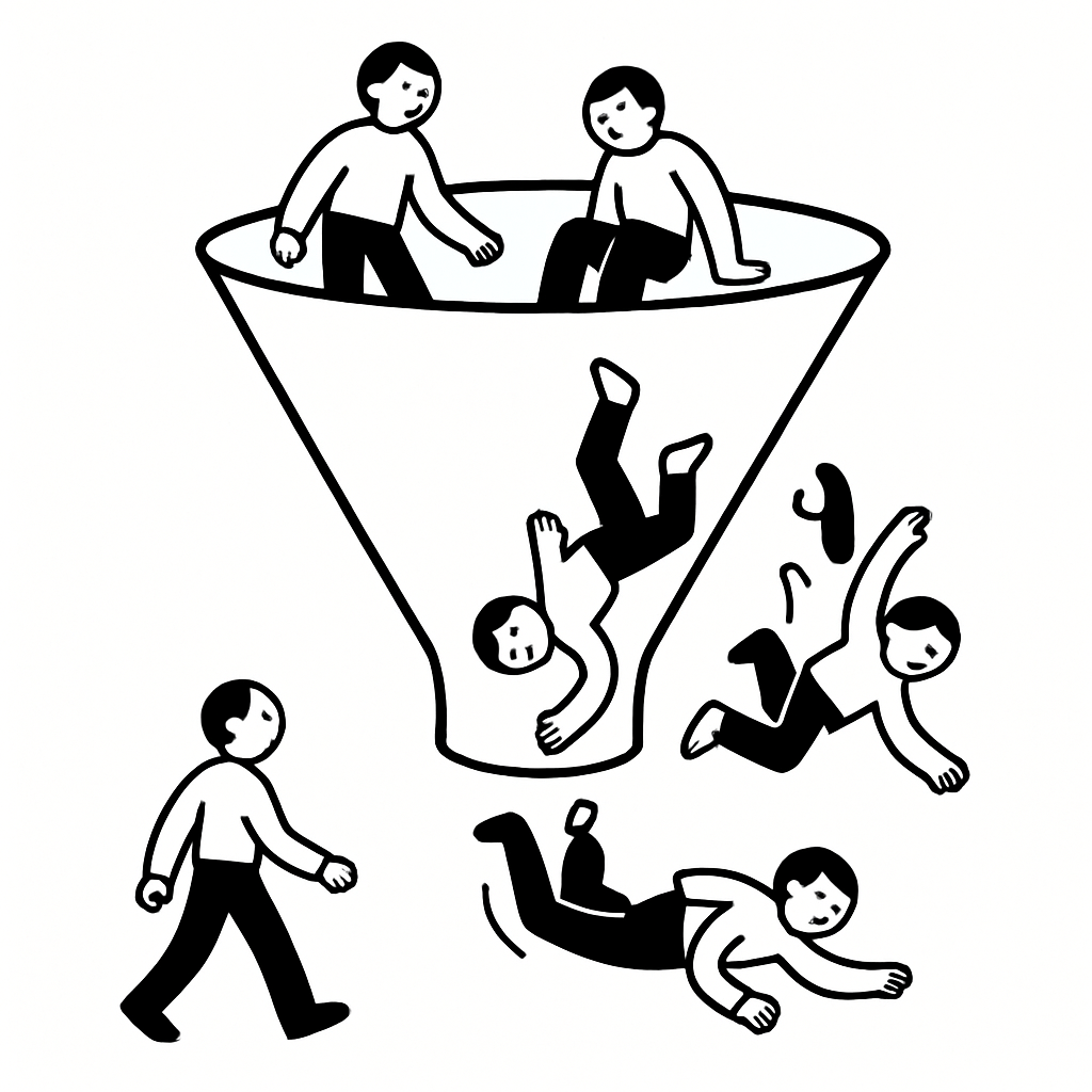
I’ve watched teams obsess over button color, headline tweaks, and pixel-perfect layouts while their funnel quietly bleeds users at every step. The uncomfortable truth: users don’t drop because of a page—they drop because a specific doubt wasn’t resolved at that moment. If you can’t name the doubt at each stage, you’re guessing.
Why optimizing pages instead of doubts fails
Most funnel work treats conversion like a UI problem. It isn’t. It’s a sequence of decisions under uncertainty, and each step introduces a new risk in the user’s mind.
When teams A/B test in isolation, they improve local metrics while worsening global conversion. I’ve seen a signup page gain +12% while downstream activation fell 18% because the new copy attracted the wrong expectations. Local wins can compound into system-level losses.
In a B2B analytics product I supported (7-person product team, self-serve motion), we ran 23 experiments on the landing page in a quarter. Traffic to signup increased, but trial-to-paid stagnated. Interviews revealed the issue: users thought we were “lightweight dashboards,” not “governed reporting.” We optimized the wrong promise. The funnel broke at expectation-setting, not at the form.
Every stage introduces a new doubt—and most funnels ignore that
Users move forward only when a specific question is answered well enough. The question changes at each step, and reusing the same proof everywhere doesn’t work.
Here’s the pattern I see across products—from PLG SaaS to marketplaces:
The doubts that actually drive drop-off
- Awareness → “Is this for me?” Category clarity beats cleverness. If I can’t place you in 3 seconds, I bounce.
- Consideration → “Will this solve my specific problem?” Generic benefits fail; users want scenario-level proof.
- Signup → “What’s the catch?” Hidden costs, surprise emails, or unclear data usage trigger hesitation.
- Onboarding → “Can I get value fast?” Time-to-first-value is the conversion lever, not feature exposure.
- Activation → “Is this worth integrating into my workflow?” Friction vs. payoff tradeoff becomes explicit.
- Pricing → “Is it worth the risk and cost?” Pricing pages fail when they don’t resolve ROI and downside risk.
If you can’t map your funnel to these doubts, you’re optimizing blind. And if you want to see how this shows up later, look at churn—why customers leave is usually the same doubt that was never resolved upfront.
Where users actually drop (it’s earlier than your analytics say)
Analytics highlights the last action before exit, not the moment conviction broke. The drop often starts one or two steps earlier.
In a fintech onboarding flow (mobile, KYC required), the biggest drop appeared at document upload. The team spent weeks improving camera UX. Interviews told a different story: users decided not to proceed when they saw “bank connection required” two screens prior. The psychological drop happened earlier; the behavioral drop showed later.
I use a simple rule: the first moment of ambiguity is where conversion is lost. Everything after is just where it becomes measurable.
This is why onboarding is a graveyard for conversion. Teams focus on screens, not the doubt sequence. If you’re seeing early churn, it’s often because onboarding never answered “how do I get value quickly?”—see why users drop off during onboarding for the patterns.
Fix the funnel by resolving doubts, not redesigning pages
The fastest way to improve conversion is to identify the top doubt at each stage and design a specific resolution for it. Not more copy—better proof.
Practical fixes that move conversion
- Make the category explicit in the first screen. Replace clever headlines with “for X who need Y” clarity. Add one concrete use case above the fold.
- Swap generic testimonials for scenario proof. “Helped us scale” becomes “reduced weekly reporting time from 6 hours to 45 minutes.”
- De-risk signup. State exactly what happens next, what you’ll email, and what data you store. Add a “no credit card, no spam” line only if it’s true.
- Engineer time-to-first-value. Remove optional steps, prefill data, or provide a guided path that produces an output in under 5 minutes.
- Expose the integration payoff. Before asking for permissions, show the outcome users will get immediately after connecting.
- Turn pricing into a risk conversation. Add ROI calculators, usage examples, and a clear downgrade path. For deeper patterns, see why users don’t convert on pricing pages.
Notice what’s missing: design tweaks without meaning. Every change ties to a specific doubt. That’s why it works.
You won’t find the real reasons in dashboards—talk to users at the moment of doubt
Post-hoc surveys and quarterly interviews miss the moment when hesitation happens. By then, users rationalize or forget.
What consistently works is capturing feedback at the exact point of friction. Ask one question when a user hesitates or exits: “What’s holding you back right now?” Then follow up with a short conversation.
On a developer tool (PLG, 50k MAU), we triggered a 2-question intercept when users hovered on the pricing page for >20 seconds without clicking. The top response wasn’t “too expensive”—it was “not sure how this fits our stack.” We added a simple “works with X, Y, Z” module and a 3-minute demo. Conversion to paid increased 21% in six weeks.
This is where I lean on Usercall. You can trigger AI-moderated interviews at key product moments—pricing hesitation, onboarding stalls, feature drop-offs—and get research-grade conversations without scheduling overhead. The controls matter: I can probe on specifics, branch on answers, and analyze themes across hundreds of interviews. It’s the fastest way I’ve found to map doubts to fixes.
If you’re deciding timing, when to ask users for feedback is the difference between vague opinions and actionable insight.
Map your funnel as a sequence of resolved doubts
Stop thinking in pages. Start thinking in decisions. Your job is to remove the biggest uncertainty at each step with the least friction possible.
Here’s the operating model I use with teams:
A simple system that keeps conversion honest
- Name the top doubt per stage. One sentence each. If you have three, you haven’t prioritized.
- Define the proof required. What would convince a skeptical user? Data, demo, example, guarantee.
- Place the proof where the doubt occurs. Not on a later page. Not in a help center.
- Instrument the moment. Track hesitation signals (time on step, back clicks, field focus) and attach a feedback trigger.
- Validate with conversations, not clicks. Use short, in-the-moment interviews to confirm you resolved the doubt.
- Guard against expectation drift. Ensure earlier messaging matches later experience, or you’ll pay for it in activation and churn.
When you run this system, funnels stop being mysterious. You can point to a step and say, “Users don’t believe X yet,” and fix that directly.
And when conversion improves, it holds. Because you didn’t trick users into clicking—you helped them make a confident decision.
Mapping where users drop off is only half the work — the real fix comes from asking why at each stage. The Conversion Rate Optimization Guide walks through that process in depth, and Usercall makes it easy to ask users directly instead of relying on funnel reports alone.
Related: why your website isn't converting · checkout abandonment reasons · why users don't sign up