
User Journey Mapping: Stop Mapping Touchpoints. Map the Decisions That Make Users Leave
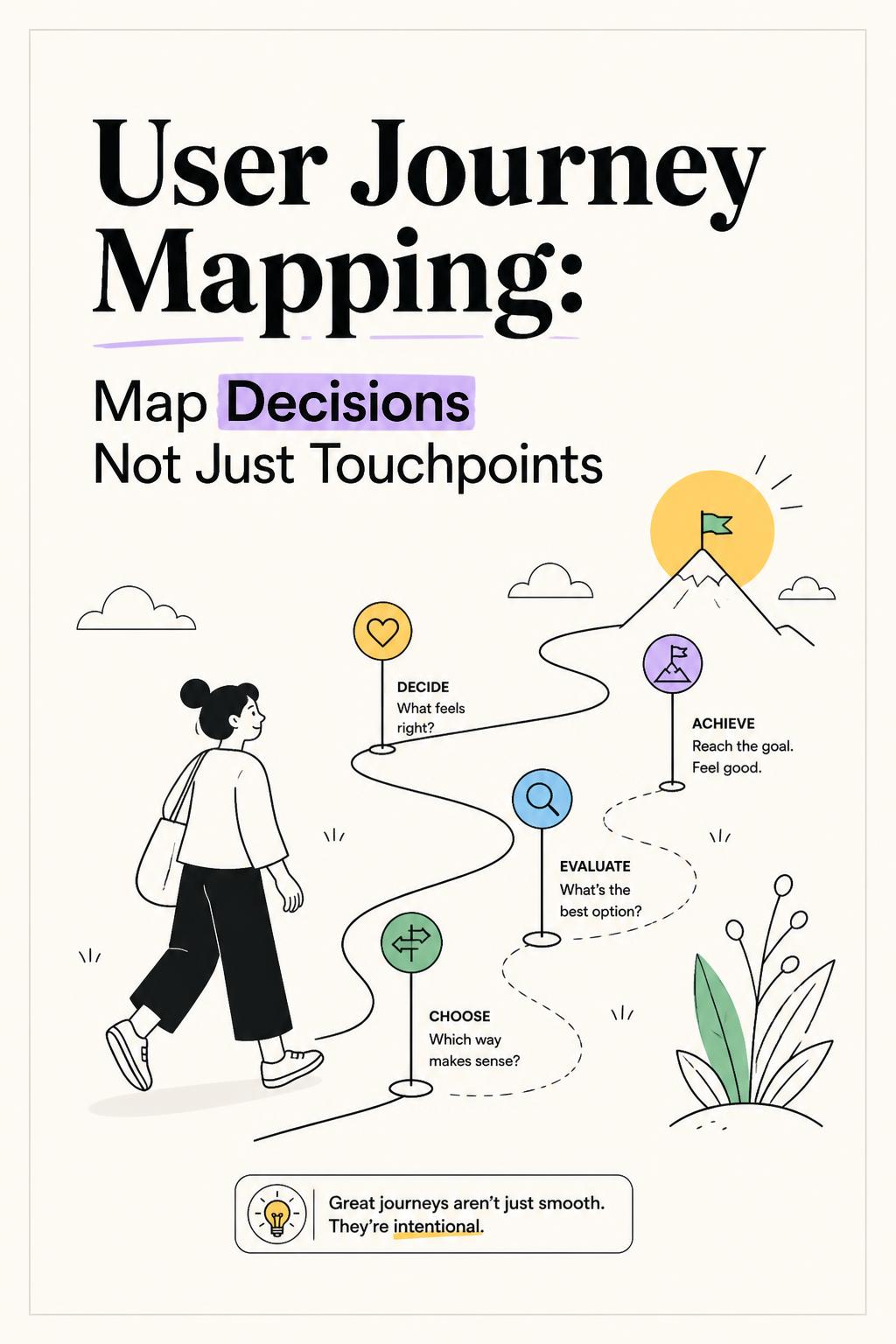
Your user journey map may be beautifully designed, full of customer quotes, and completely useless. I have watched teams spend days aligning on a map that showed awareness, consideration, signup, onboarding, and retention—then spend the next quarter fixing the wrong part of the product. The map recorded where users went. It never uncovered why they stopped moving.
That is the central mistake in user journey mapping. Users do not experience your product as a sequence of touchpoints. They experience it as a series of risky decisions: Is this worth my time? Will this work for my situation? Can I trust this output? Do I need permission? What happens if I get it wrong? Until a journey map answers those questions, it is an internal workflow diagram with customer labels pasted on top.
A useful user journey map reveals the moments when momentum breaks, the uncertainty behind that break, and the evidence a user needs to continue. That is the standard product, UX, research, and growth teams should hold themselves to.
What a user journey map should actually do
The purpose of user journey mapping is not to document every screen, campaign, email, or support interaction. Analytics can already tell you much of that. The map’s job is to explain the invisible logic behind behavior.
Consider a user who visits a landing page, starts a trial, connects a data source, creates a dashboard, and never invites a teammate. A conventional journey map might label this “onboarding friction” and recommend more tooltips. A decision-led map asks what changed after the first dashboard was created. Perhaps the user doubts the data is accurate. Perhaps they do not want colleagues to see unfinished work. Perhaps inviting a teammate introduces a political problem because the team already relies on a familiar spreadsheet.
Those are not variations of the same problem. They require fundamentally different interventions.
At every meaningful stage, a strong user journey map should answer:
- What progress is the user trying to make? Describe the real job, not the feature interaction. “Prepare a credible performance update” is more useful than “build a dashboard.”
- What triggered action now? Urgency changes behavior. A looming board meeting creates a different journey from casual exploration between projects.
- What decision must the user make? Continue, delay, compare alternatives, request approval, use a workaround, or abandon the effort.
- What uncertainty is blocking the decision? The usual sources are value, effort, trust, implementation risk, social risk, and budget approval.
- What proof would make progress feel safe? The answer may be a product change, an example, a guided workflow, a security artifact, or a shareable business case.
This is why user journey mapping deserves more rigor than a workshop exercise. It is a way to identify the decision constraints that shape conversion, adoption, and retention.
Why most user journey maps fail before they are even published
The most common mapping process begins with a cross-functional workshop. Marketing contributes channel knowledge. Sales contributes objections. Product contributes the intended user flow. Customer success contributes common tickets. Then the team votes on pain points.
This approach feels collaborative, but it has a serious flaw: it substitutes internal memory for customer evidence. Every department sees only one slice of the journey, and every department tends to interpret friction through its own incentives. Marketing sees messaging gaps. Product sees usability issues. Sales sees pricing or objection handling. Support sees documentation problems.
The user sees none of these functions. They see a problem they need solved with limited time, incomplete information, and a real cost if the choice goes wrong.
Broad stages hide the decisions that matter
“Awareness,” “consideration,” and “conversion” are reporting categories, not research categories. They are too broad to guide a product team. Even “onboarding” often hides five distinct commitment moments: deciding to import data, deciding which workflow to change first, deciding whether the product is trustworthy, deciding whether to involve teammates, and deciding whether the initial result is valuable enough to repeat.
If you collapse these moments into one stage, the remedies become vague. Teams start saying the experience needs to be “simpler” when the actual issue may be that customers fear making an irreversible change to a live workflow.
Generic pain points produce generic fixes
“Users find setup confusing” is not an insight. It is a starting point for research. A useful pain point includes context, expectation, and consequence: “Finance managers exit at account mapping because they expect a reversible preview, but believe one incorrect field could corrupt month-end reporting.” That statement points to a concrete solution: sandbox validation, clearer reversibility, and a preview that compares mapped outputs against known records.
One fictional user obscures the real journey
Especially in B2B, the person who discovers a product is often not the person who configures it, approves it, pays for it, or uses it daily. A product manager may start a trial, an operations lead may need to validate the workflow, IT may need to approve access, and an executive may need to see business value. They are part of the same buying process, but they have different risks and different definitions of success.
A single average persona makes these dependencies disappear. The result is a map that blames an individual user for friction created by organizational complexity.
Use a decision-led framework for user journey mapping
I recommend building a journey map around commitment moments. A commitment moment is any point where the user must spend something scarce: time, effort, money, data access, attention, political capital, or trust. This is where a journey becomes either stronger or weaker.
Here is the workflow I use when the goal is to turn research into a map that can drive prioritization.
- Choose one outcome, not the entire lifecycle. Map a specific high-value outcome such as “first report shared with leadership,” “first team workspace launched,” or “renewal approved.” A lifecycle map is useful for orientation; it is usually too broad to identify a fix.
- Segment by decision context. Separate users based on conditions that change their tradeoffs: urgent versus exploratory, self-serve versus sales-assisted, first-time buyers versus customers replacing an incumbent tool.
- Mark commitment moments. Identify decisions such as connecting data, inviting colleagues, trusting AI-generated output, asking for budget, changing an established process, or publishing work externally.
- Pair behavioral data with direct customer evidence. Product analytics reveals where users hesitate or leave. Interviews, support conversations, session evidence, survey responses, and open-text feedback reveal why.
- Write evidence-backed decision hypotheses. Use a format such as: “Users delay inviting teammates because they cannot demonstrate value before asking colleagues to change behavior.”
- Match the intervention to the uncertainty. Solve value uncertainty with proof, effort uncertainty with guided action, trust uncertainty with transparent evidence, and approval uncertainty with material users can forward internally.
The discipline here is important: do not label every drop-off as a usability defect. A pause can be rational. A user deciding whether to connect sensitive customer data may understand the interface perfectly and still need a low-risk test environment, permission controls, or a security explanation they can defend to IT.
Find the “why” behind the metric, not just the drop-off
Product data is excellent at revealing where investigation should begin. Look for abrupt funnel exits, repeated backtracking, unusually long time between steps, feature adoption that does not predict retention, and support contact immediately before cancellation. These patterns reveal behavioral discontinuities. They do not explain them.
That explanation requires research in context. The highest-value questions are not “Did you like this step?” or “Was it easy to use?” Ask users to reconstruct the decision:
- What were you trying to accomplish before you opened the product?
- What did you expect this step to do?
- What made you pause, postpone, or look for another option?
- Who else would be affected if you made the wrong choice?
- What did you do instead, and why was that acceptable?
The workaround question is unusually powerful. Your real competitor may be a spreadsheet, a manual report, an agency, an analyst, an existing workflow, or simply doing nothing. A map that ignores workarounds overestimates how urgently users need your product.
In one onboarding study I ran for a B2B analytics platform, session data showed users abandoning setup after creating their first dashboard. The product team assumed the dashboard builder was too complex. We interviewed nine inactive trial users under a tight two-week decision window and found a different pattern: most had successfully built dashboards. They stopped because they did not trust the data enough to show it to leadership. The most effective changes were visible data checks, plain-language metric definitions, and a comparison against the customer’s existing reports. Simplifying the builder would have treated the symptom, not the decision barrier.
Map emotion only when it changes behavior
Emotion lines are one of the most overused elements of user journey maps. A curve from “curious” to “frustrated” to “satisfied” may look persuasive, but it rarely tells a team what to do.
Map emotions only when they produce a behavioral consequence. Anxiety creates delay. Embarrassment prevents users from asking for help. Mistrust blocks adoption. Relief can create repeat use and advocacy. The key is to connect emotion to a commitment moment.
I saw this clearly while researching a research repository product. Product managers repeatedly exported findings to slides instead of sharing the repository directly with executives. The initial conclusion was that the collaboration feature was weak. In interviews, the real concern was social risk: researchers did not want leadership to encounter raw feedback without their interpretation. They feared losing control of the narrative. The right response was not merely better sharing permissions. It was curated executive views and AI-assisted summaries that preserved researcher authorship while making evidence easier to consume.
Turn the map into a prioritization system
A user journey map should end with ranked decisions, not a poster on a wall. For each commitment moment, assess reach, impact, and confidence.
How many valuable users encounter this decision?
Does it mildly slow progress, delay adoption, or end the journey?
Do you have direct evidence of the cause, not just a plausible theory?
Prioritize problems with high reach, high impact, and strong evidence. When confidence is low, research before building. This is where AI-native qualitative research can be particularly useful: intercept users at key behavioral moments, run moderated follow-up interviews with the right context, and analyze patterns across responses without flattening the nuance that explains each decision.
If 60% of activated users never invite a teammate, do not immediately add another invitation prompt. Determine whether they lack value confidence, permission to invite, a collaborative use case, or willingness to disrupt an established process. One metric can contain four different journeys.
The test of a useful user journey map
The best user journey maps are not agreeable. They expose where company logic and customer logic diverge. They show that a feature request is actually a trust problem, that a conversion problem begins before a user reaches pricing, or that a retention issue starts with an unconvincing first result.
If your map confirms what the team already believed, it has probably failed. If it changes what gets funded, which customer question gets asked next, and how success is measured, it is doing its job. Stop mapping touchpoints as if they are the journey. Map the decisions users must make—and the uncertainty that makes them leave.
Run the week on concept testing: 15 to 30 AI-moderated interviews, with quotes back in 48 to 72 hours.
For a step-by-step, research-led process to build this kind of map from scratch, check out the complete customer journey mapping guide. When you're ready to gather the decision-level insight behind each drop-off, Usercall can run those customer conversations for you and turn them into clear, decision-based journey stages.
Related: Concept testing questions · Concept testing research · CPG packaging · Concept testing examples
Related: why most journey maps focus on the wrong touchpoints · the one mistake breaking most client journey maps · fixing journey maps that don't drive conversions